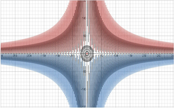
Desmos Art 1: This graph looks like this because there are 2 different kinds of equations. The first is a form of x^2+y^2=(some number). This equation forms the circles in the center. The bigger the "some number" gets, the larger the radius of the circle. The other equation is a form of y=(some number)abs((cosx)/x). The larger the "some number" gets, the farther away the points get. The red and blue parts are more distant than the inner black parts. The two colors overlapping give it a 3D effect.
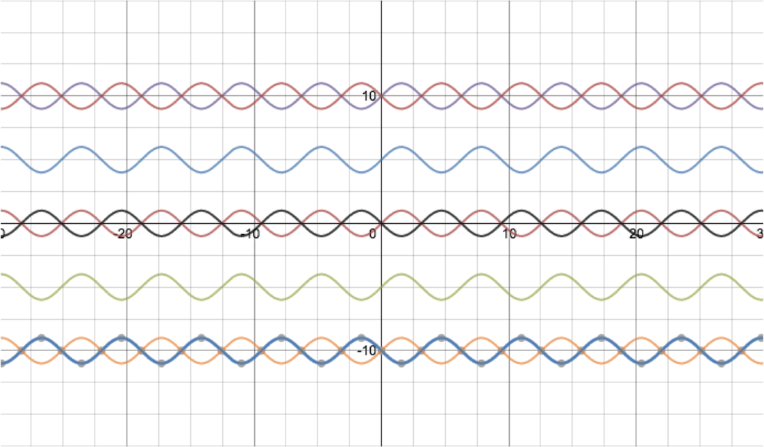
Desmos Art 2: This graph looks as it does because it uses many variations of the sin function. We can change the position of of the graph by adding a y intercept. I did that at 5, -5, 10, -10. When you add a - before the sign it flips the x intercepts so the lane waves the opposite way.
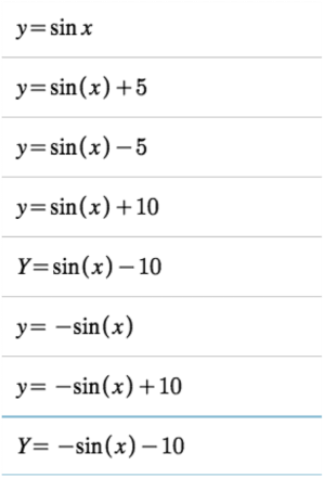
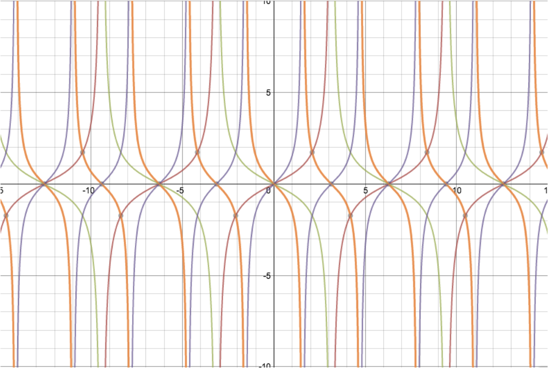
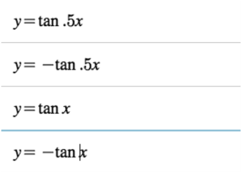
Desmos Art 3: This final graph looks this way because of the tangent function. Although it looks complex, it's really just 4 equations. The tangent function crosses the x-axis at one spot. Changing the number before the x will change the width of the graph. Putting a number before the tangent symbol flips the graph the other way from left to right, to right to left.
Desmos Art 3: This final graph looks this way because of the tangent function. Although it looks complex, it's really just 4 equations. The tangent function crosses the x-axis at one spot. Changing the number before the x will change the width of the graph. Putting a number before the tangent symbol flips the graph the other way from left to right, to right to left.
 RSS Feed